On the website "Сa-news.org" published article "Why do maps distort the size of several continents? - Turkish cartographer". It is the opinion about map projections Hasan Nokay, head of the Turkish Association of Piri Reis, involved in mapping, real estate and geographic information systems. The full article is available on the link.
Various methods of map projection used in the compilation of the maps, lead to the fact that such huge continents like Africa look a lot less, and the United States, Russia and Europe - much more than they really are. This writes the Turkish news Agency Anadolu, citing the opinion of Hasan Nokay, head of the Turkish Association of Piri Reis.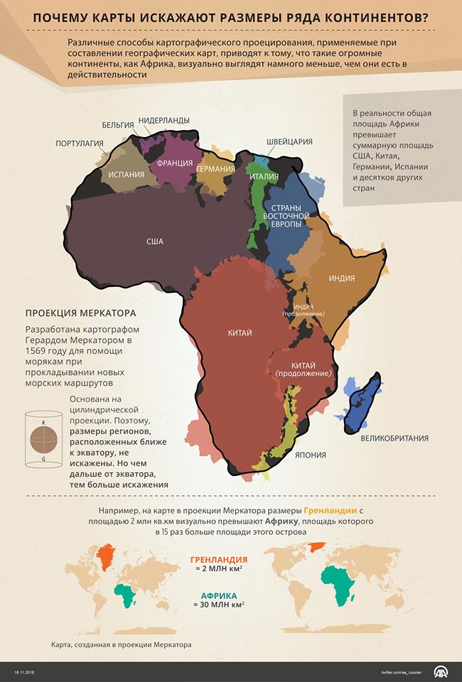
A world map made in 1569 the Flemish cartographer Gerardus Mercator for sailors today still use in educational institutions. She laid in navigational equipment and is the basis for digital maps Google Maps. This card was made using a cylindrical projection, the regions which are located closer to the poles, it seem much smaller than they really are. For example, the size of Greenland on this map visually exceed the African continent, whose area is 15 times larger than the area of the island.
"Flemish cartographer Mercator made his map for sailors, so they could use it to blaze new sea routes. The map has greatly facilitated the work of seafarers. In the maps compiled on the Mercator projection, the sizes of the regions located closer to the equator, are not distorted. But the farther from the equator, the more distortion," said Hasan Nokay.
Hasan Nokay believes that it is necessary to abandon the use of maps with cylindrical projection.
The total area of the African continent is approximately 30 million square kilometers, which exceeds the total area of the United States, China, Germany, Spain and Turkey. However, due to inaccuracies in the mapping of the African continent seems much smaller than US and Canada put together, the message reads.
Despite the new methods of cartographic projection, from the XVI century used the maps where the US, Russia and Europe seem much larger than they really are.
According to him, talking about the fact that Mercator maps are used for centuries for political purposes, did not subside until now.
The head of the Association also noted that there are maps in which the sizes of continents and countries are not distorted.
"The fact that the size of some countries and continents are projected onto a map of the distortion indicates the presence of social and political interests of certain forces. The area of Russia, which on the map seems huge, in reality is 60 percent of the area of the African continent," said Hasan Nokay.